Hilers World is a business that specializes in creating unique culinary experiences for customers. However, when we first met the team, we noticed that their brand identity lacked the visual appeal and consistency needed to stand out in the competitive food and beverage industry.
To begin the branding overhaul process, we conducted extensive research on the top brands in the industry and identified key elements that would be useful for Hilers World branding strategy. We then developed a persona for Hilers World ideal customer base and used this as a foundation for creating a new logo that captured the essence of the brand.
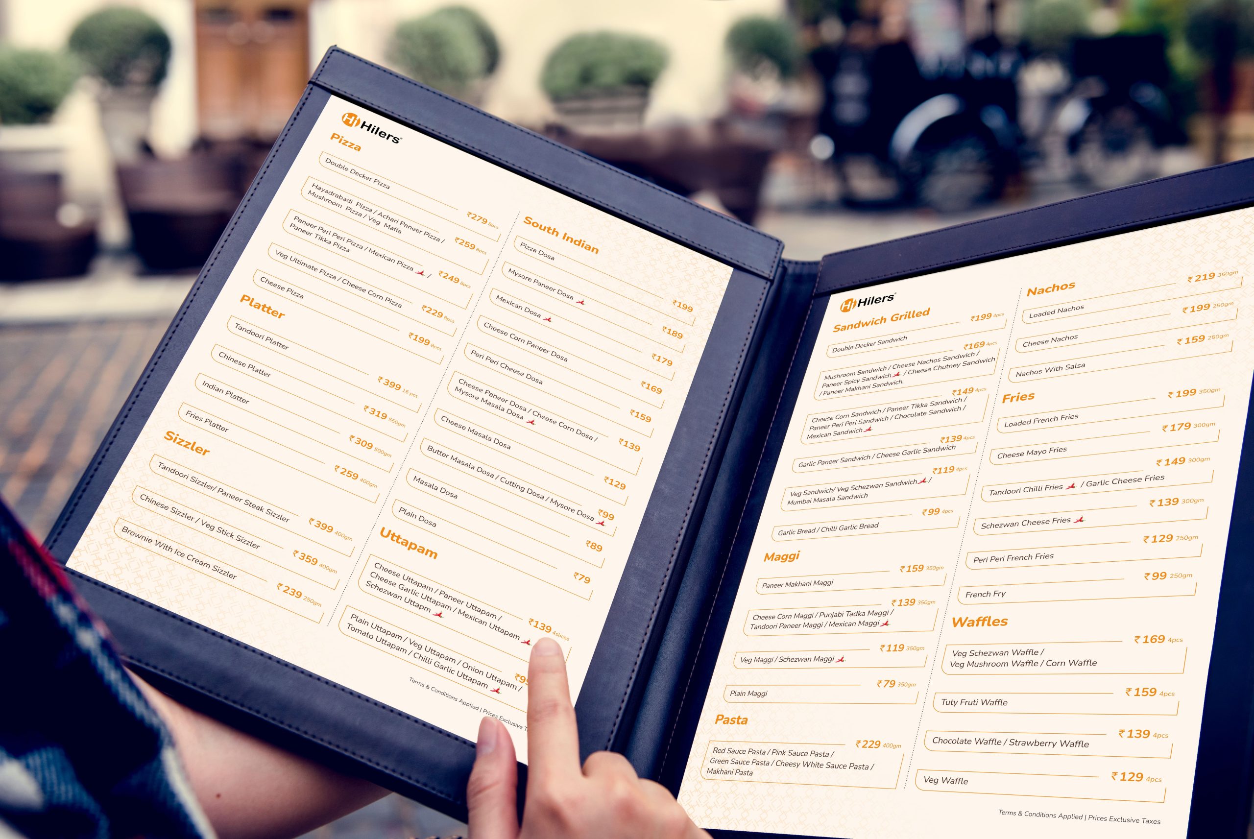
Next, we worked on creating a cohesive visual identity by developing typography, color palette, and style scapes that ensured that the brand had a consistent look across all mediums. We also designed new packaging that not only looked visually appealing but also reflected the quality and uniqueness of Hilers World food offerings.
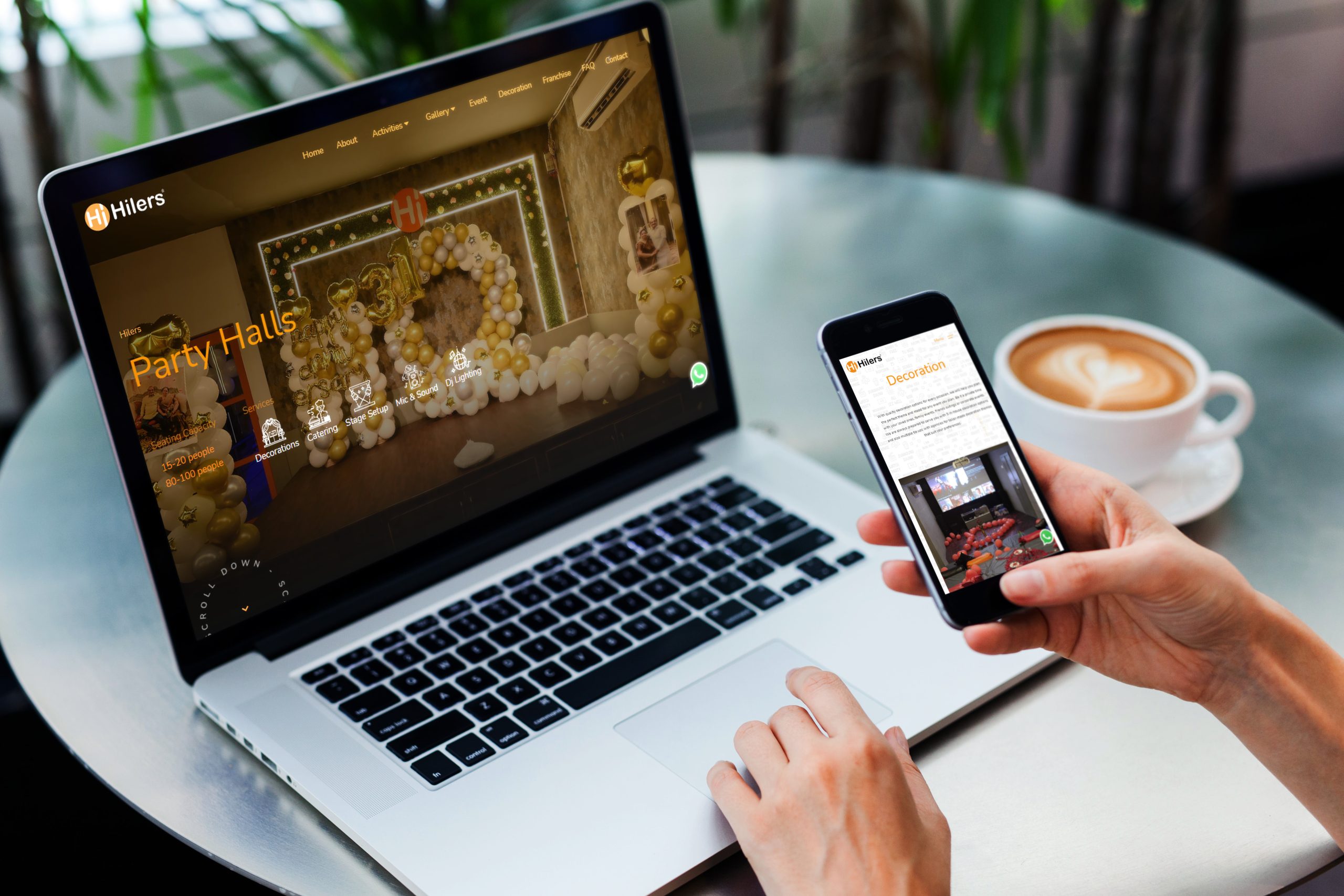
To enhance the brand’s digital presence, we redesigned their website to be more user-friendly and visually appealing, incorporating high-quality images of their food and drinks to entice customers. We also developed a brand guide that outlined specific guidelines for using the logo, typography, and other visual elements to maintain consistency and reinforce the brand identity.
Lastly, we created a comprehensive marketing strategy for Hilers World that included designing enticing creatives, developing informational pamphlets, and keeping their social media presence active and engaging to keep customers informed and excited about their offerings. With our help, Hilers World has now established a strong brand identity and is ready to make a mark in the industry.
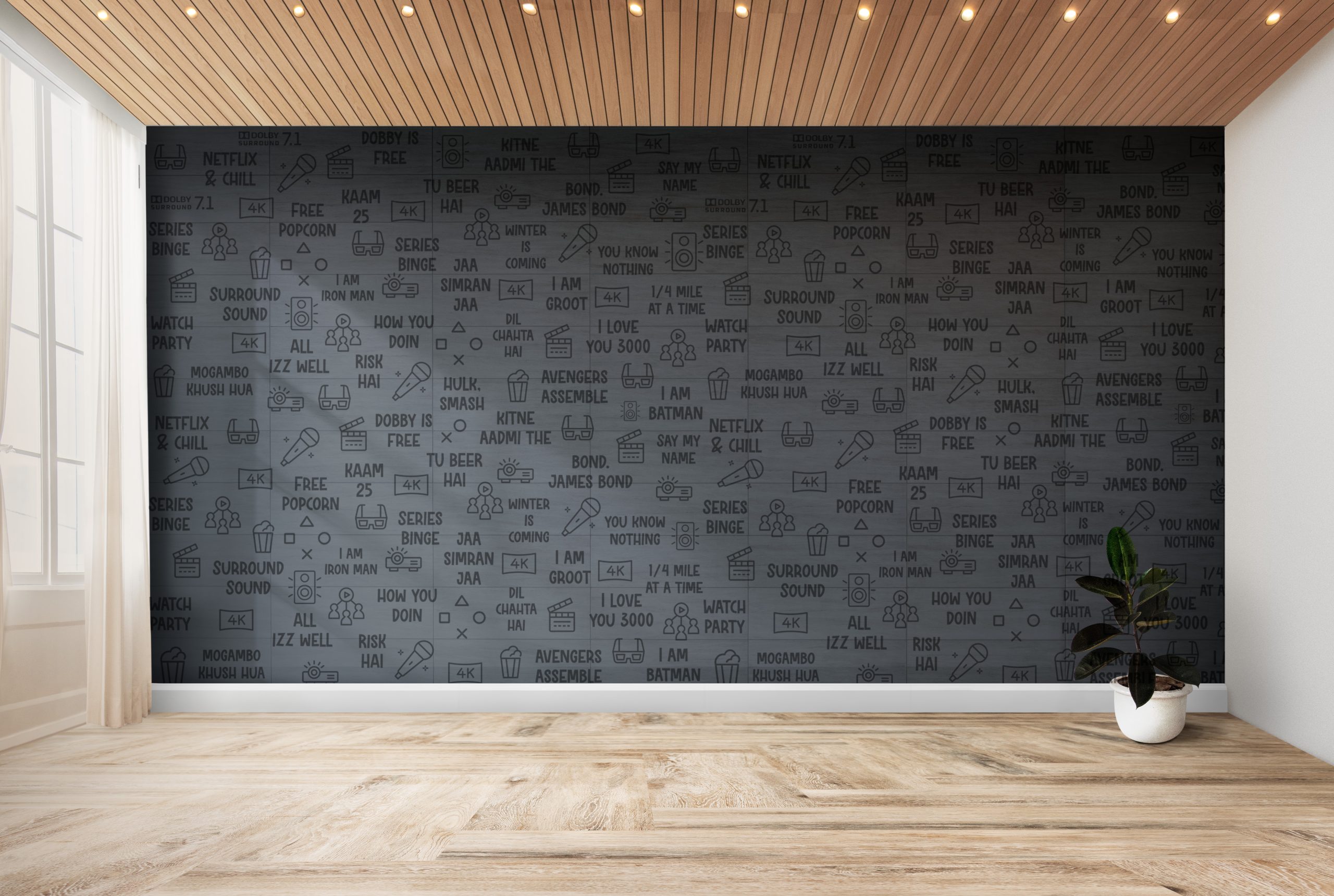
One of the primary colors we use in our branding is orange. Orange is a warm and energetic color that represents creativity, friendliness, and enthusiasm. It’s the perfect color for a cafe, as it creates an inviting and lively atmosphere. We use different shades of orange in our branding, from bright and bold to muted and subtle, depending on the context.
Another color that we use in our branding is Cork. Cork is a natural and earthy color that represents warmth, stability, and comfort. We use brown in our branding to convey a sense of home and comfort, making our customers feel relaxed and at ease while enjoying their meals.
Flesh color is another color we incorporate into our branding. It is a soft, muted tone that represents warmth, comfort, and familiarity. We use this color in our branding to create a cozy atmosphere, making our customers feel like they’re in a comfortable, homely space.
Finally, we also use Mine Shaft color, which is a dark gray color, in our branding. This color represents sophistication, elegance, and timelessness. We use this color in our branding to create a sense of refinement and quality, emphasizing the high-quality ingredients and exceptional service that we offer.
By using a combination of orange, Cork, flesh, and mine shaft colors, we create a cohesive and welcoming brand identity for Hilers World . These colors work together to convey warmth, comfort, sophistication, and creativity, making our cafe the perfect destination for anyone looking for a comfortable and inviting atmosphere to enjoy their meals.